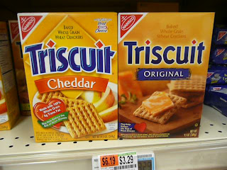
 Here is the new Triscuit packaging (old on the left, new on the right). I don't like it. I think the type looks unfinished, and the layout lacks personality. The food shot (what we call appetite appeal) is amazing, though. Harley loves the new pack. And since the target is women, which Harley is, that's all that matters.
Typically, Kraft (who owns Nabisco) has very bright, bold packaging. It feels very bubbly, for lack of a better word (bubble letters). This design is a much different look for them. More natural and wholesome looking. Almost European. It might be part of a larger trend towards Kraft being all about 'natural.' Check out the new Kraft salad dressing packaging, which is all about purity.
Kraft is not doing well. Its parent company Altria (aka Philip Morris, a corporation which I helped name and design), are looking to sell Kraft because it's bringing the rest of the stok down. No matter how expensive cigarettes are, people will pay. Hopefully for them, this will work. If not, some people I used to work with may be out of jobs.
4 comments:
I've seen the new pure Kraft dressing commercials - I was intrigued, I must admit. I am not the least bit impressed with this new Triscuit packaging though - very basic, old fashioned, too wholesome - maybe that's what they're going for, but that's not what makes me choose one box out 50others on a shelf all other things being equal (whole wheat, quality, etc.). You know me, throw some sparkles on the box and ypu've got my attention. =)
Triscuits are always awesome. Period.
That was me. Forgot to log in. Andrew's a loser.
I LOVE the new packaing. Very clean and (yes, Andrew) European. That said, I really HATE Triscuits! So, although I might be Kraft's target, I will not be purchaseing the pretty box of Triscuits. The End.
Post a Comment